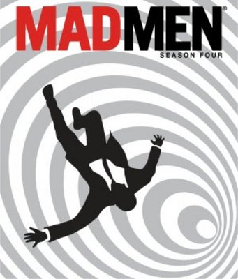
Although “Mad Men” was a show that paid a lot of attention to detail, it did mess up on occasion.
For instance, the writing on the sign on the Sterling Cooper building in the early seasons is in the Gil Sans font, a font that was not in popular use until the seventies! Boy, I really hope somebody got fired for that blunder.
But for the most part, it’s a show that successfully immerses its viewers in the crazy world of the sixties, with the clothes, slang, furniture, and the characters’ values all consistently era-appropriate.That pursuit of full immersion extended into the casting of the extras on the show, who also needed to look like believable upper-class people of the time.
This created some problems for the casting directors, because it was often hard to find suitable actors in Los Angeles who met showrunner Matthew Weiner’s particular standards.
Read full article
